Well, this isn’t really week one of development. It’s just week one of this new devlog. I’m going to be posting what my intended goals for development each week are from here until the game is ready for release. Hopefully this will help keep me on-track and focused as well as build interest in the game itself. I’ll start with a short recap of what I finished last week, then detail my goals for the coming week.
Last week I started looking into ways to process real money payments in Unity. Unity has its own built-in IAP service that unifies the purchasing API for a bunch of different storefronts like apple pay, google play, or windows store. However, none of these are primarily desktop-focused stores, and probably wouldn’t be appropriate integrated into desktop software. So I went looking across the internet to see if anyone had implemented a good payment processing system for Unity, and eventually I came across PlayFab. PlayFab is a backend service provider tooled specifically for game development. They have the capability to run the entirety of your game’s backend, from player logins to in-game economy setup to multiplayer server hosting.
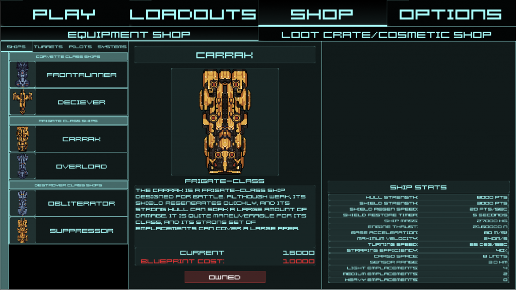
Up until last week, I kept my backend service running on Google’s cloud platform, using their app engine and a MySQL database to log in players and get player account data. Over the last week, I’ve migrated my login, store, and loadout storage over to PlayFab’s backend. I’ve also re-tooled my Shop UI and the Loadout Design UI, as well as updating the look of the login screen. While I’m pretty satisfied by the loadout design UI, the store UI could still use some work. Here’s a look at it currently:

It’s got a list with collapsible headings displaying available items on the left, and a panel with stats, description, and image on the right. This works pretty well, but the list is not very usable when working with categories with more entries. Also, there’s no screen space constantly available to show user-specific information (like their amount of credits). To combat this, I intend on making the list UI fill most of the screen, with a box on top allowing for selecting/sorting different types of items. Once an item is clicked, the panel displaying detailed stats would open for a better view of the item and to complete the purchase. This can then also double as the planned “Collection” screen, as players could display only items they own vs items they don’t vs all items. Improvements to the Store UI will likely take up a generous portion of the week.
Also on the table for this work week is improving the way that loadouts are stored in PlayFab. First off, a default loadout list will be set up such that each player will download the default loadouts and have them made available during play. This lowers the engagement needed with menus for the first play drastically, as users can hop into game and have some loadouts ready for them to play with. In addition to loadouts, a default rotation of pilots will also be made available for all players. Once the default loadouts are set up, it’s time to secure loadout storage and verify loadout storage data in PlayFab. I’ll be writing some Cloud Script functions to validate ownership of items included in loadouts before storing, as well as preventing clients from directly modifying the loadout data. In the case that all that is finished, we’ll move on to implementing loot crates!
Well, that should be it for the next week of work. See you next monday!
